Mass General Brigham Health Plan
Members couldn’t find their way around the portal, and former members had to call for their tax forms. I redesigned both, and tax form requests fell 45%.
- Role
- Sole UX Designer: research, IA, UX and service design
- Tools
- Figma, Qualtrics
- Team
- Amy Lam, Abe Moses, Regina O’Neil, with engineering, legal and customer service
- Timeline
- 2023 to 2025

Finding Care
The Problem
Fewer than one in five active members had signed up for the portal, and the ones who had found it hard to use. In the 2023 member survey, only 35% said the portal was easy to navigate. Its menu followed how the plan was organized inside, not how members look for things.
How might we help members find what they need without calling for help?
Research
With our UX lead and the director of customer experience, I audited the portal and the app, studied Aetna, Blue Cross Blue Shield, Cigna, Anthem and EmblemHealth, and designed three tests: a card sort of the menu, four mobile menu styles, and three homepage concepts.
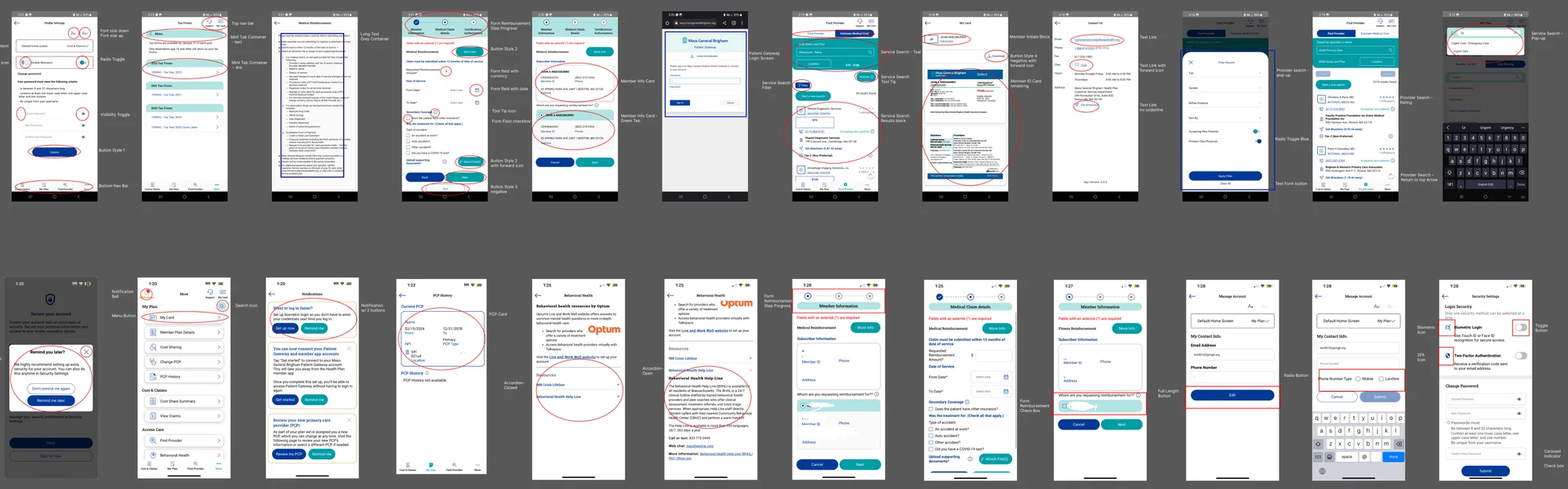
What We Learned
Members come to the portal for care first. In the homepage test, 55% had a favorable first impression of the care-focused homepage, against 48% and 44% for the other two.
Led to: Find Doctors & Care moved to the front of the menu, and the homepage leads with care.
Menu labels confused members. In the card sort, they grouped items differently from the menu.
Led to: Each section was renamed with clear, action-led words members already know.
Some pages, like View Claims, fit more than one category.
Led to: Those pages appear everywhere members might look for them.
The Design
The new navigation launched in April 2024.
Results
- Find information easily (35% → 61%)
- +26 pts
- Answer questions without help (44% → 60%)
- +16 pts
- Overall satisfaction (54% → 70%)
- +16 pts
“This homepage would make me feel like my health insurance provider genuinely wants to empower me to manage my health care.”
Tax Forms for Former Members
The Problem
When a member’s plan ended, they lost access to the portal, but they still needed their tax forms. Each January and February, customer service got over 400 requests for them, and reps could only send them by email, PHI included.
How might we help former members get their tax documents safely, without calling customer service?
Research
I interviewed customer service reps, reviewed their calls, and audited the portal a former member would land in: 5 top-level sections and 35 submenu items between them and one form. Two people came up again and again: a former member who needs their tax forms, and a member switching plans who isn’t sure where to look.
What We Learned
Former members came back for one thing: their tax forms.
Led to: Tax documents became the main action, with a status banner pointing to them.
35 submenu items meant too many paths to the wrong place.
Led to: 4 top-level sections and 12 submenu items.
Constraints
- Five months, to launch before tax season in January.
- Two engineers and a PM, also shipping other releases at the same time.
- Access and legal requirements around PHI.
Design Decisions
Two Paths to a Portal for Former Members
- Considered
- Reuse the standalone product I designed in September 2023 for pre-effective members, adopt its newer UI and add new features. Those features would later move into the main portal. I took it as far as lo-fi prototypes.
- Chose
- Strip down the existing portal, built on the CRM and connected to member data. Keep only what inactive members needed, including the secure document portal, so customer service could send PHI there instead of email.
- Why
- Time, engineering capacity, and access and legal requirements. A bonus: former members kept the portal they already knew, with features removed instead of a new interface to learn.
The Design
The portal for former members launched in January 2025, just before tax season. I tested the pared-down flows with customer service reps first, and wrote a release brief each quarter so the team could answer members’ questions.
Results
- Fewer tax form requests (400+ → 222)
- 45%
- PHI sent by email (down from 400+)
- Zero
“You should have seen the Teams screen today ‘light up’ with hearts and applaud emojis. There is so much less activity to CS as a result :)”
Reflections
- Security Is a UX Problem
- Emailing PHI by hand was a support burden, a security risk and a broken experience all at once. Solving all three made the case for design as a business function.
- Constraints Refine Impact
- There was no time for a new portal, so I redesigned the navigation logic instead. Taking things away, not adding them, is what cut the calls.
- What I’d Do Differently
- Measure findability directly. The survey gains can’t separate the new navigation from everything else that changed that year. Next time I’d run a tree test before and after launch.
Notes
- MGBHP member survey, 2023.
- MGBHP homepage concept test, three concepts with 103, 100 and 105 members.
- MGBHP member survey, 2023 against 2024. Gains are percentage points.
- Customer service tax form requests, January to February: the tax season before launch against the first one after.