
Mass GeneralBrigham Health Plan
MGBHP is an integrated healthcare plan that connects its members to the Massachusetts’ largest premium provider network.
RecognitionMost Active Digital Strategies - Beckers Healthcare
- Role
- UX DesignUX ResearchIA RedesignService Design
- Tools
- FigmaQualtrics
- Team
- Director of CXPMsEngineeringLegal
- Timeline
- Nov 2023 – Sep 2024
Overview
As the sole UX designer for the member app and portal, I rebuilt navigation around how members think about care and shipped a self-service tax portal for former members. I also audited accessibility across mobile and web and led the move to a WCAG-compliant design system.
45%fewer tax document requests
ZEROPHI email transfers
Challenge

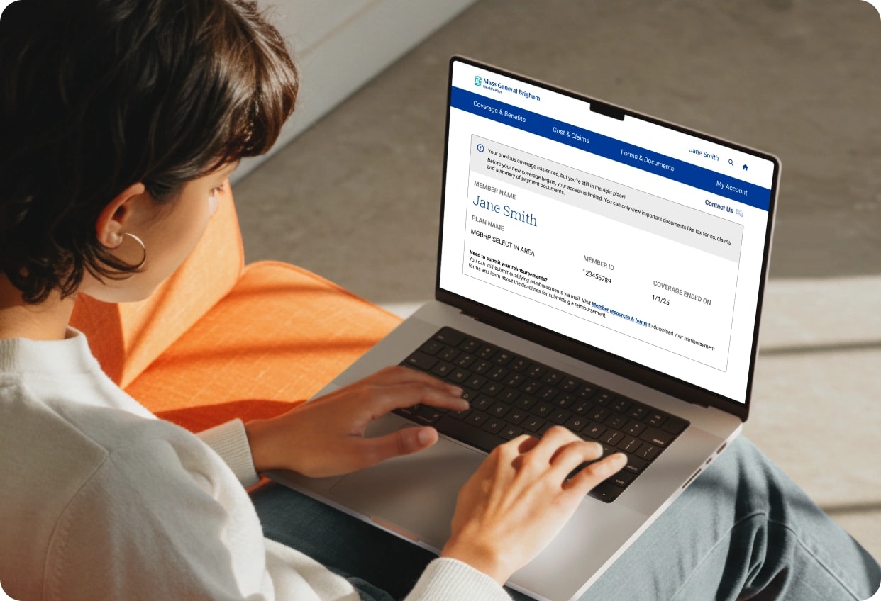
Every January, hundreds of calls came in from members with expired plans, all asking for the same document. Reps had no way to send it except by email, which was a security risk.
Customer Service Rep
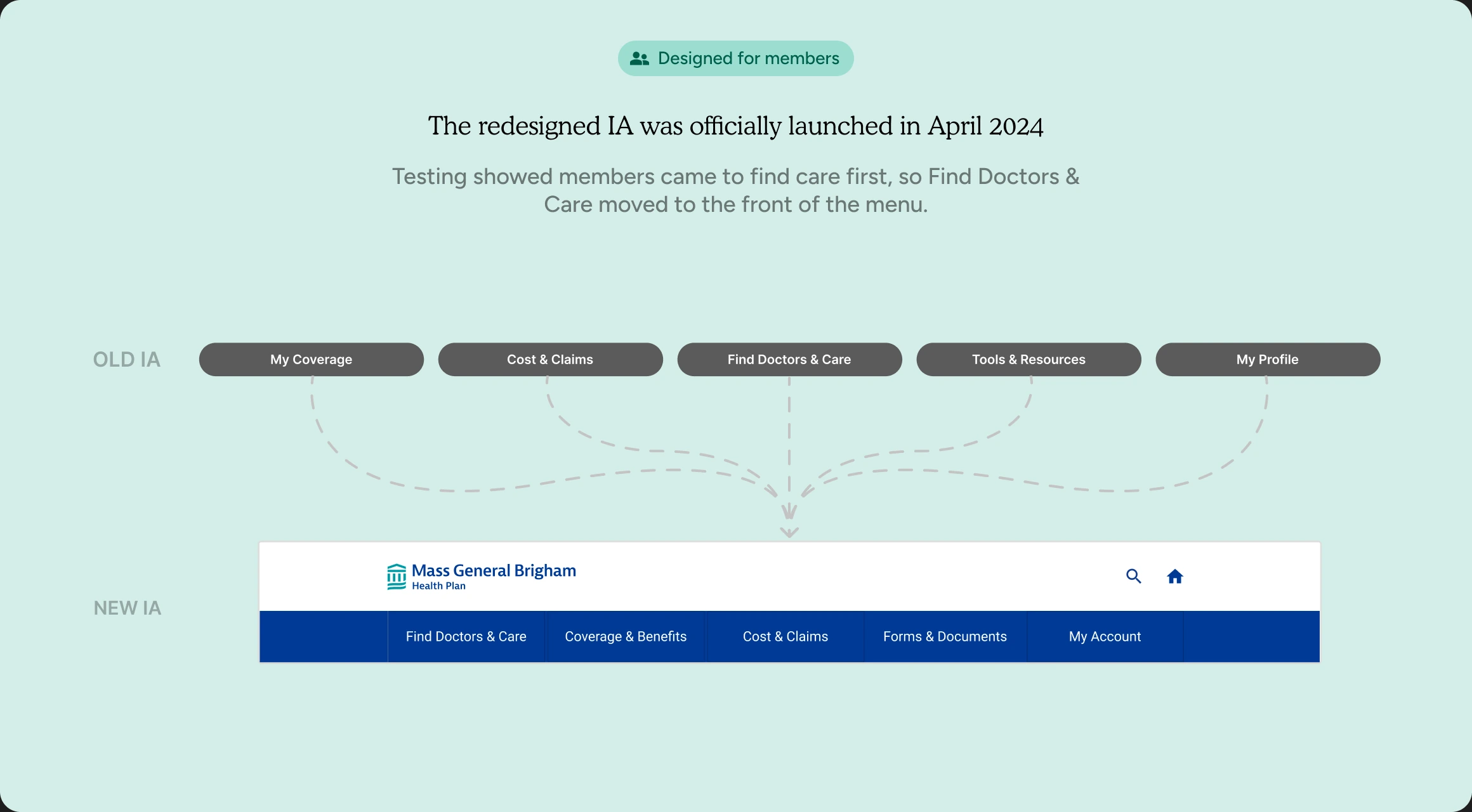
According to the 2023 survey, over 65% of members struggled to navigate and 62% couldn’t locate their own benefits and documents.
Health Plan Members

Research
Mobile Menu Testing
Designed four distinct menu layouts exploring different hierarchies, groupings, and visual patterns. Each reflected a unique structural hypothesis.
Homepage Redesign Validation
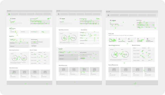
Designed and tested three homepage concepts with distinct focuses to determine which layout best supports member’s needs.
First Problem Statement
How might we help members find what they need without calling for help?
Solutions
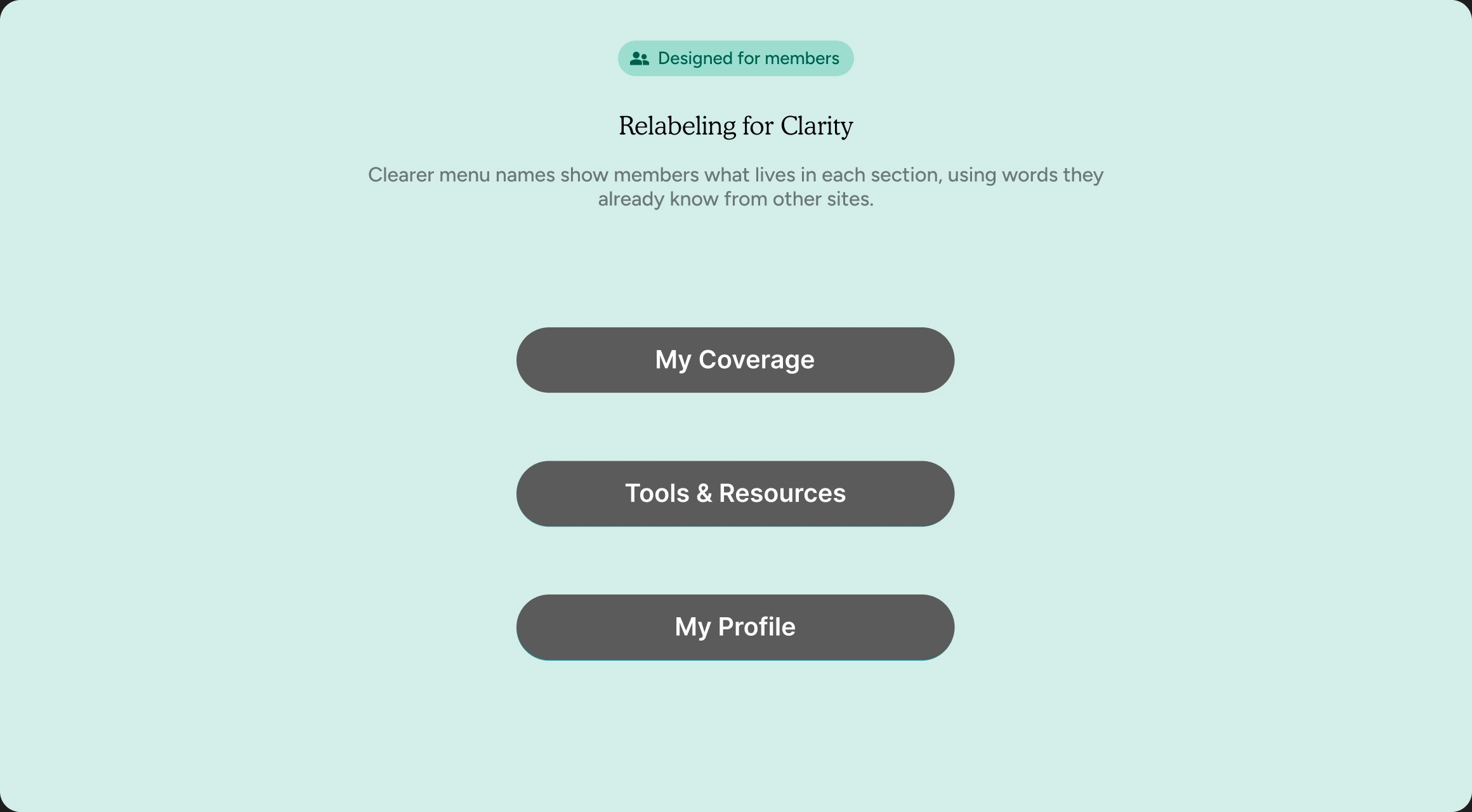
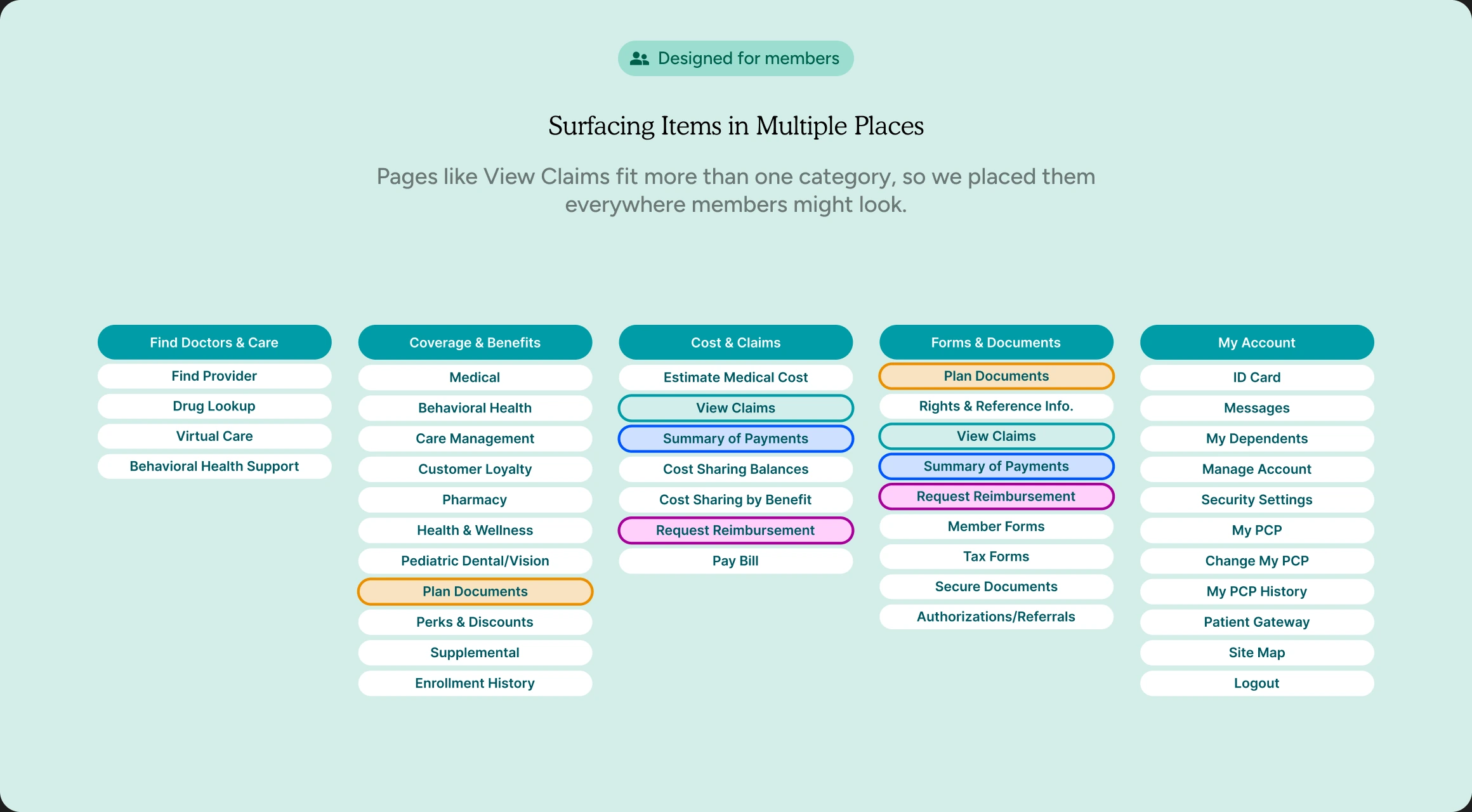
 Designed for members
Results
“This homepage would make me feel like my health insurance provider genuinely wants to empower me to manage my health care.”

Source: 2023–2024 patient survey
Second Problem Statement
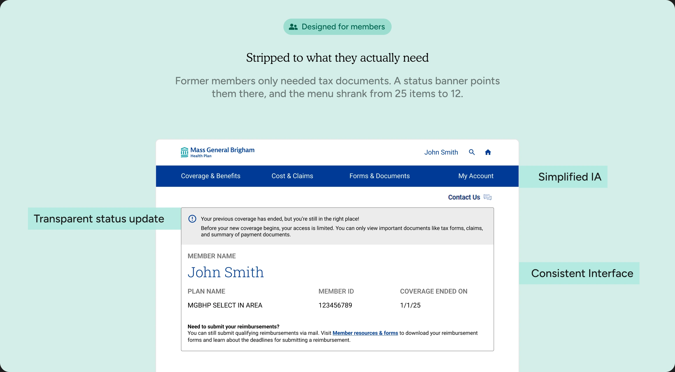
How might we help former members get their tax documents safely, without calling customer service?
Solutions
 Designed for engineers
 Designed for customer service
Results
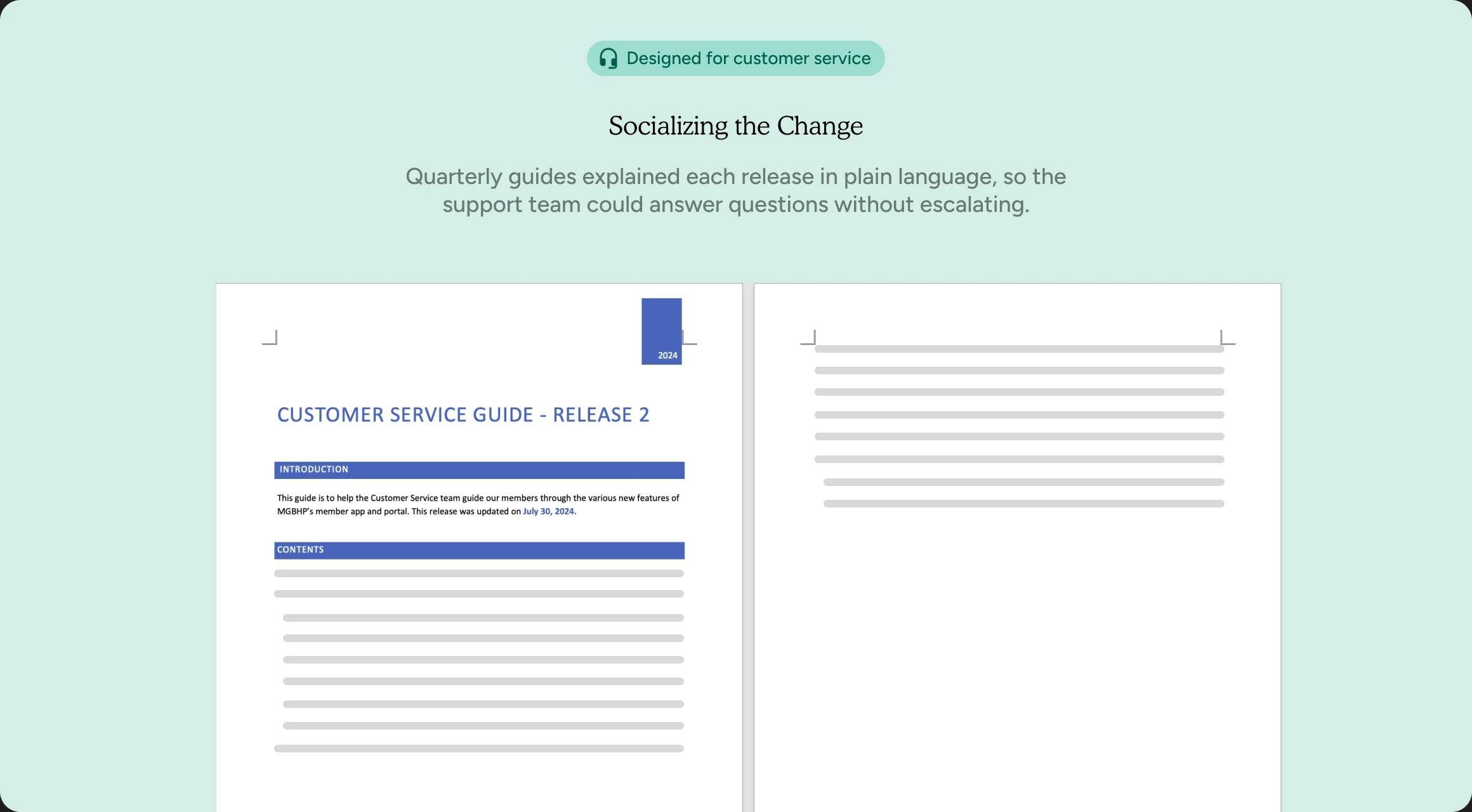
“You should have seen the Teams screen today 'light up' with hearts and applaud emojis. There is so much less activity to CS as a result :)”

Reflections
Users don't think in org charts
The old navigation mirrored internal structure. Rebuilding it around how members think about care drove the biggest gain in findability.
Security is a UX problem
Manually emailing PHI was not only a support burden, it was a security risk and a broken experience. Solving both at once made the case for design as a business function.
Small changes, big results
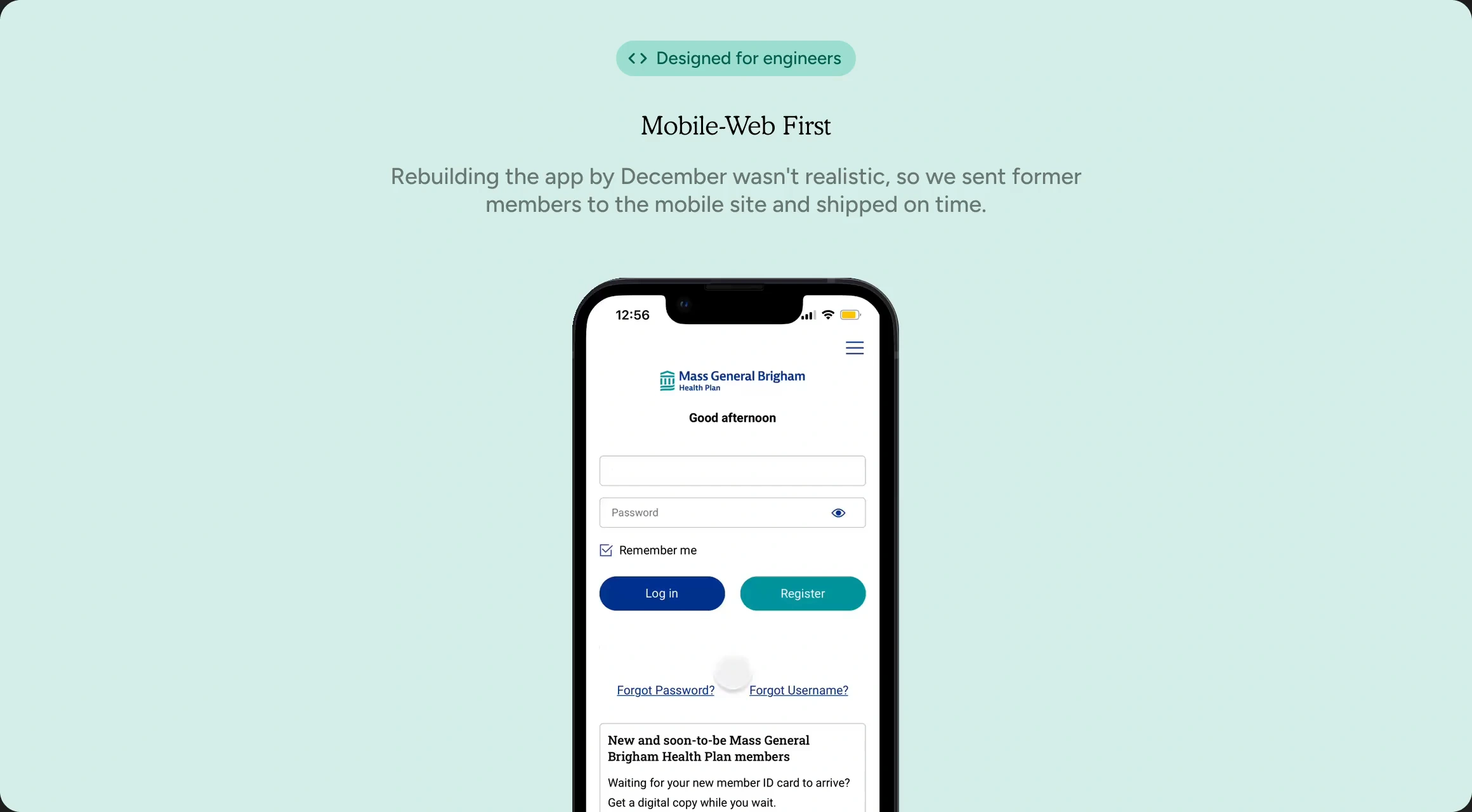
The visual edits for former members were minimal. The impact was not. A focused portal cut call volume and freed the team for higher-value work.